The "look" was obviously hugely influential, the "feel" not so much. It is quite an odd beast, as the mouse is actually only used for selecting objects.
The Lisa GUI prototypes are also and interesting bit of GUI trivia. It's easy to see the Star's influence on the final shipping version of the Lisa GUI compared to its prototypes.
It is quite an odd beast, as the mouse is actually only used for selecting objects.
It's an interesting design. The mouse appears to be strictly reserved for establishing a source object and a target location on-screen. The action to perform using these two inputs is determined by physical buttons on the keyboard -- Copy, Move, Show Properties...
(It is slightly confusing because some operations don't need two inputs. Does "Show Properties" act upon the selected source object, or whatever is under the location of the mouse cursor?)
The mouse-oriented design that won in the market (introduced with Mac, adopted by Windows) ended up avoiding the keyboard in favour of much more complicated mouse action gestures such as double-clicking, drag'n'drop, right-click menus.
I wonder if the Star design would have been more user-friendly in the end. When I've helped older people with their computers, it seemed that they don't make use of drag'n'drop or right-click menus at all. With this limitation, they couldn't do something like duplicating a document without starting the producer application and performing a "Save As" from its main menu.
> The mouse-oriented design that won in the market (introduced with Mac, adopted by Windows) ended up avoiding the keyboard in favour of much more complicated mouse action gestures such as double-clicking, drag'n'drop, right-click menus.
Nit picking here, but right-click was obviously not introduced with the single button Mac mouse. And the awful double-click gesture was made necessary because of this single button mouse, the original Apple sin.
Sure. What I meant that Apple diverged from the Xerox UI path by designing the Mac around the mouse, so that the keyboard was not necessary for any actions. Microsoft basically took up that idea wholesale, simply extending it with more widespread keyboard shortcuts (Alt key for menu accelerators) and new mouse-centric gestures like right-clicking (borrowed from elsewhere of course).
In PC history, there were two opportunities to redesign the input hardware for a new kind of GUI...
First was in 1987 when IBM introduced the PS/2. It was a play for IBM to regain control of the wild west PC clone market, and failed as that, but the PS/2 keyboard and mouse connector standards lived on for more than 15 years. If IBM had revamped the keyboard at that point with something like the Star action buttons, they would have become a part of the OS/2 GUI and subsequently Windows.
Another junction was in 1995, when Microsoft launched Windows 95 and introduced new keyboards with the Windows key. At this point Microsoft carried so much weight with OEMs that I think they would have been able to push through something more radical on the input device front, if they'd wanted.
The idea of "select things with the mouse, perform operations with keys under your left hand" goes back to Doug Engelbart's NLS system. The Xerox folks will undoubtedly have known about this work.
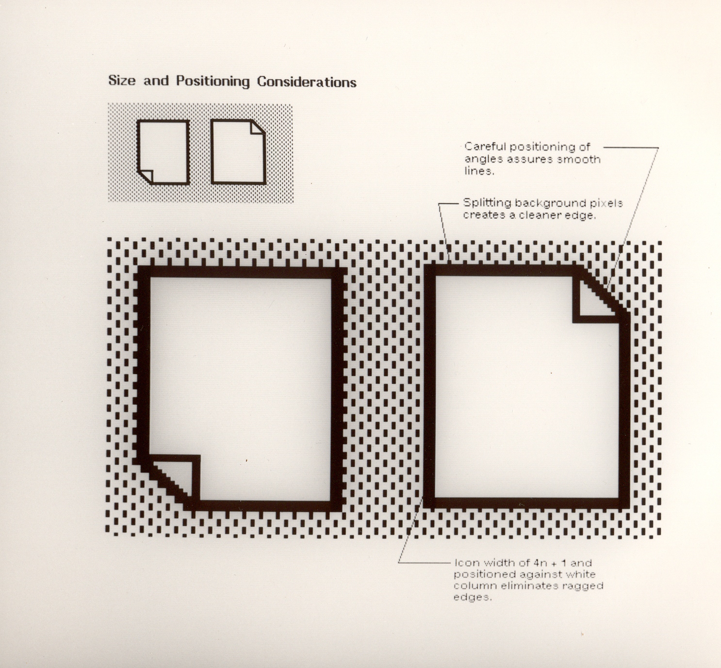
I'm impressed by the utmost attention to details. I remember similar care when working with educational software for Apple IIs - we limited our 50% checkerboard pattern to 279x191 (instead of the 280x192 maximum) in order to be able to do exactly the same rounded corners on all four corners of the screen.
At times, the guy who came up with these ideas infuriated me, but, in hindsight, I am very glad I surrounded myself with such perfectionists.
"My Cajun country upbringing had never taken me any further west than Dallas. And since I wanted to make a good first impression on my new California friends, I purchased a spanking new three-piece navy blue polyester suit, super-wide ‘70s tie, platform shoes and the finest imitation naugahyde briefcase I could find and made my first reservations at Rickey’s Hyatt House.
I arrived at the lobby of PARC, resplendent in polyester and cheap Old English cologne, and was met by Charles Irby… ponytail, scruffy beard, tie-dyed t-shirt, khaki shorts and Birkenstock sandals. He welcomed me warmly, and then took me around to meet the eclectic cast of colorful characters and future luminaries that made up the Star development team. As we toured the offices, and the more folks I met, and the more beanbag chairs I saw, the more conspicuous, foreign and puritanical I began to feel… a penguin in the company of parrots. And yet, I was embraced and welcomed into this cadre of characters. It would not take me long to assimilate."
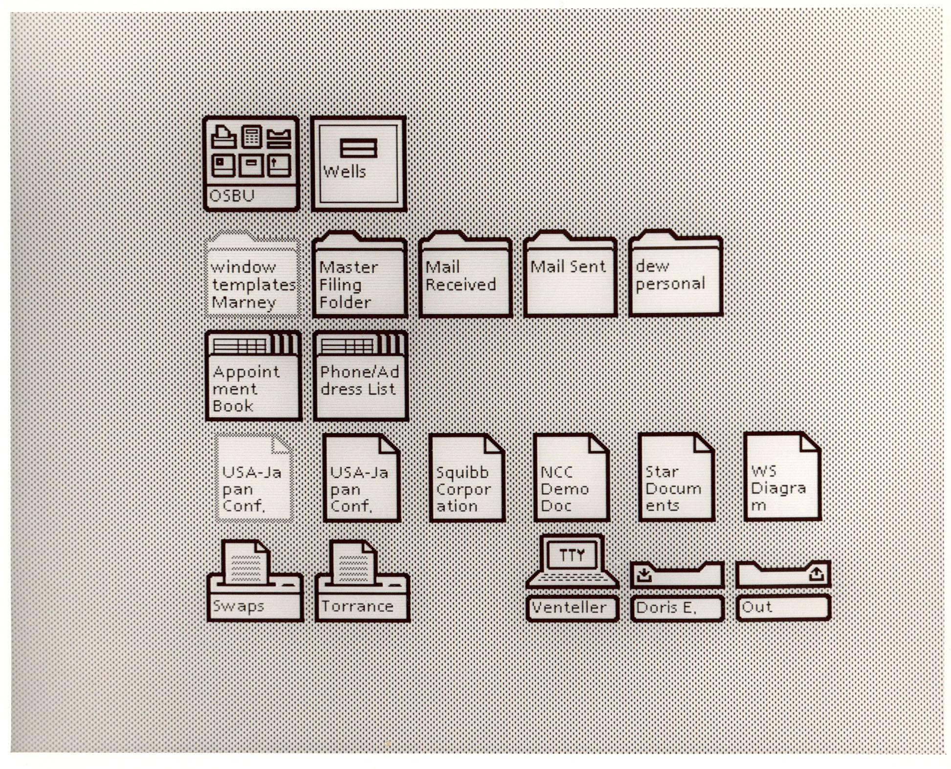
I'm old enough to have used these machines and what's interesting is that I remember well how much of a 'wow' it was to get to use a lovely user interface like that. Since then I haven't seen a real step change in user interface until we moved recently to sensitive touch screen devices.
I remember I was working on the desktop part of the system, and we were implementing "background copy" - and the hardest part was figuring out what the UI should be for doing a foreground copy vs a background copy. (The Star had tiled windows, not overlapping, so there wasn't a model of just letting a status window overlap.)
Whoops! Context lost when I posted that. What I was saying was .. I was a programmer on Star from 82-89. I went straight from college to Xerox - and it was like working in a time machine. Network based file and print servers, email, directory services, mouse, GUI, etc etc. All on machines that had at most 1.5 megabytes of memory.
Actually the first GUIs from Xerox were on the Alto, which the Star is based on (see: http://en.wikipedia.org/wiki/Xerox_Alto). Although this is certainly from the first that was available commercially.
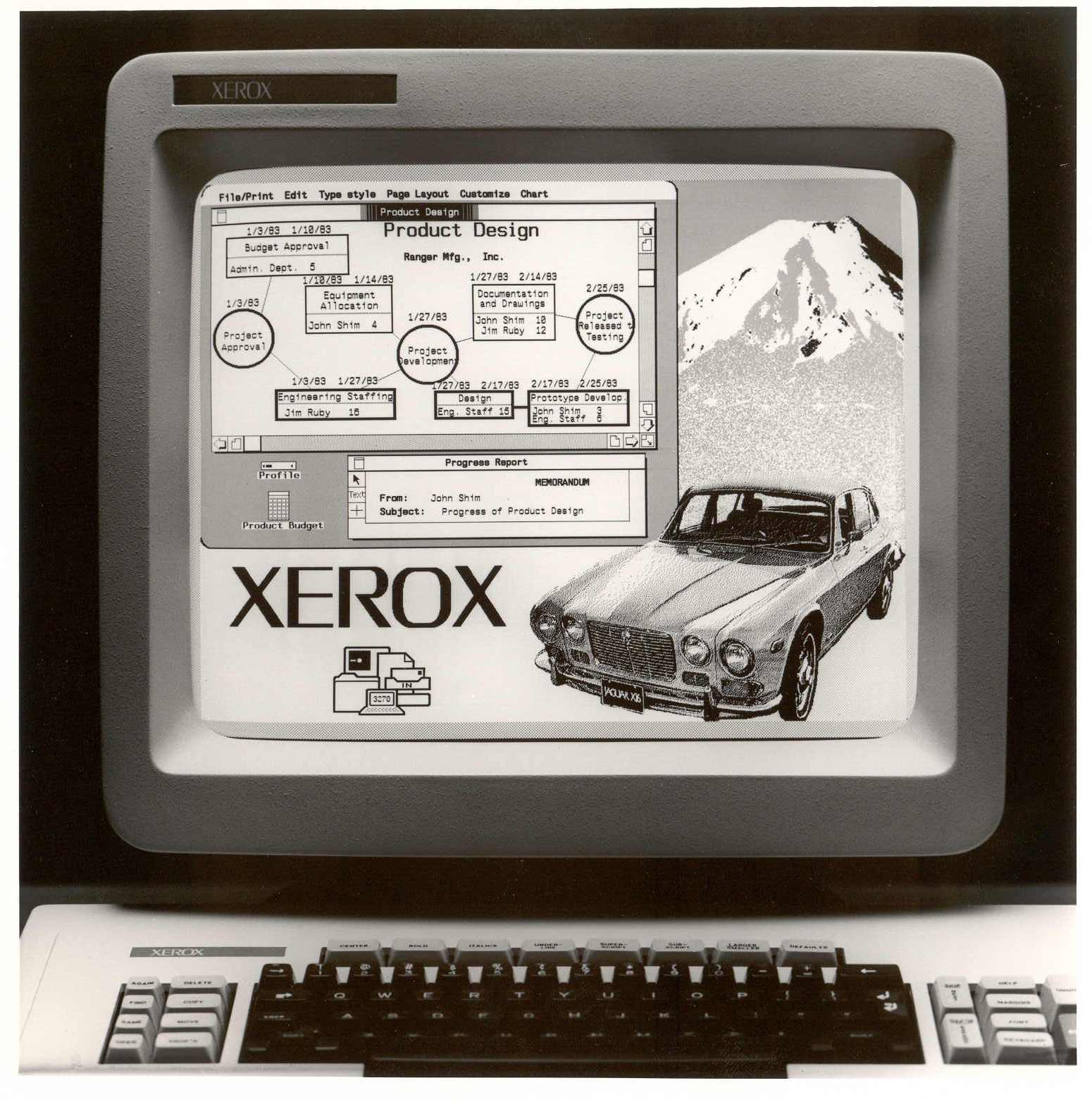
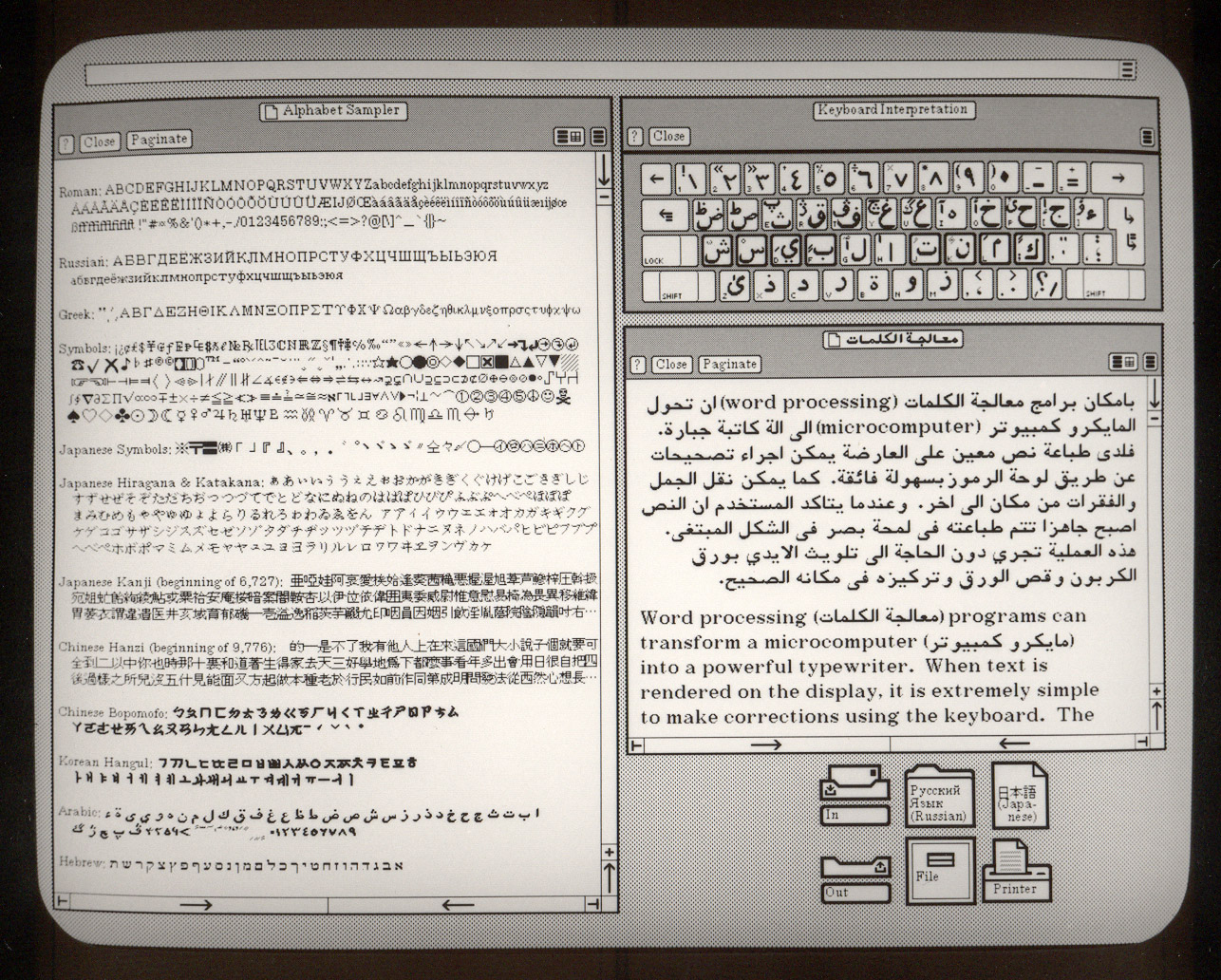
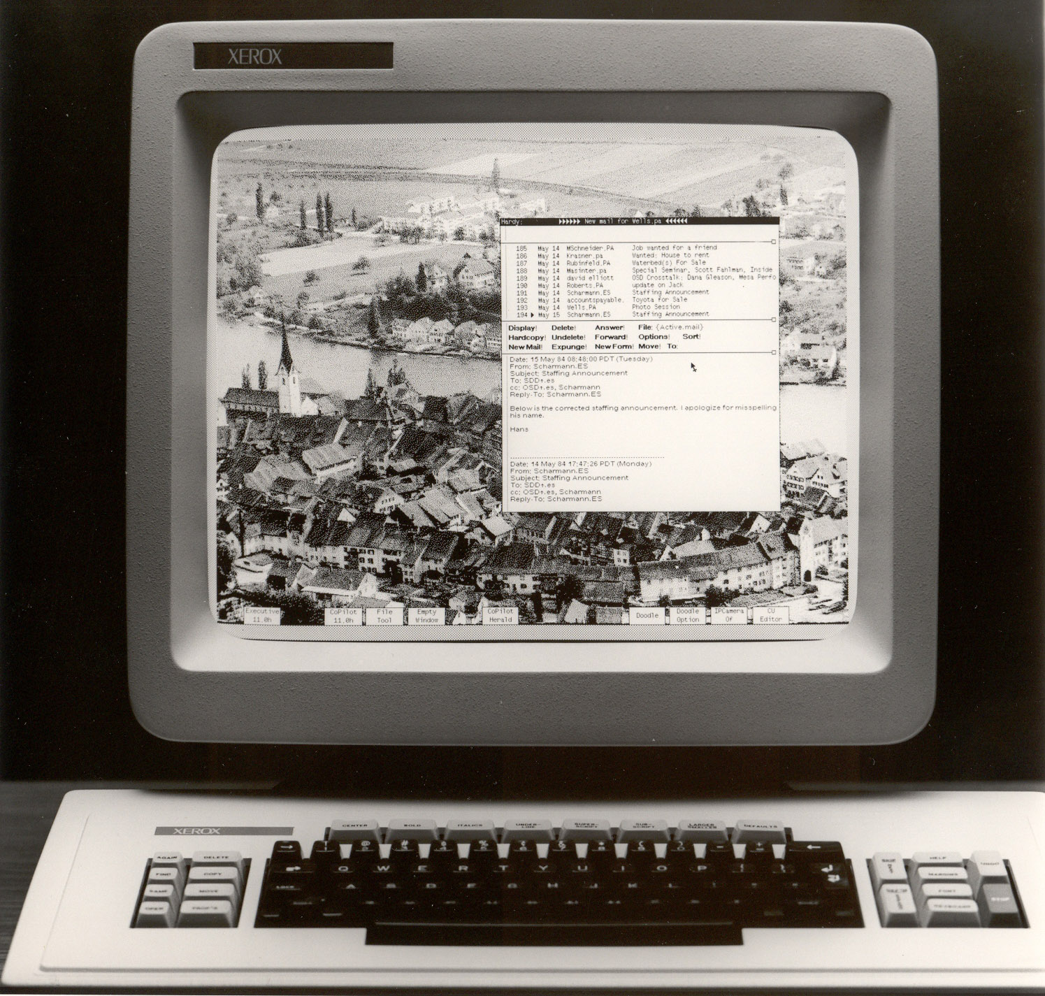
Nonetheless, these screenshots are amazing and show how groundbreaking the GUI concept was at the time.
And if you're into watching long videos of what the digital future was supposed to look like, Douglas Adams and Tom Baker made a documentary called Hyperland, and you can watch all 50 minutes of it here: http://video.google.com/videoplay?docid=7190175107515525470# or if you want a shorter video, here's Ted Nelson with a short demo of Xanadu as it existed in 2008: http://www.youtube.com/watch?v=En_2T7KH6RA
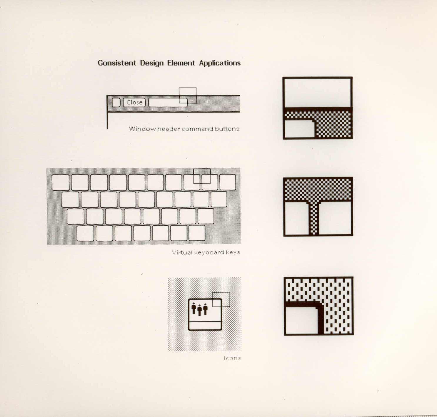
Very impressive. One inconsistency stands out given the careful attention to detail. In this image, they make a point of emphasizing that background pixels should be split to form a cleaner edge:
The background contains vertical bars 2 pixels high. The edge of the icon should therefore be positioned so that only 1 pixel of the vertical bars is showing rather than having both pixels showing. Also the left and right edges should have the whitespace between the vertical bars showing rather than the vertical bars directly adjacent to the left and right edges.
Also, I'm only seeing the inconsistency in the concave parts of the icons. The outer border is fully consistent with the design guidelines.
Wow, I see the Mac, Amiga and other next gen UIs that came soon afterwards in these. I'm also struck by how much more appealing these screenshots appear than the early versions of Microsoft Windows.
I'm pretty sure someone could come up with a skin for a desktop (KDE, Gnome, whatever...) very close to these screenshots and it would still feel very modern.
Over thirty years later and so little has changed... I think Alan Kay had a quote about there being no significant new inventions in computing since 1980.
I will never understand why Xerox did not sue the pants off Jobs when he stole 99% of this visual gui design and then claimed forever onward that Apple was responsible for it.
The thing that killed this was at that time no company was going to spend close to the salary of a typist to outfit said typist with this kit. (I believe it was in the 10-20K range.)
http://www.youtube.com/watch?v=Cn4vC80Pv6Q
The "look" was obviously hugely influential, the "feel" not so much. It is quite an odd beast, as the mouse is actually only used for selecting objects.
The Lisa GUI prototypes are also and interesting bit of GUI trivia. It's easy to see the Star's influence on the final shipping version of the Lisa GUI compared to its prototypes.
http://www.jeremyreimer.com/apple_screens.html