What I really want is one of these powered by gps. The time already comes for free in the signal, and from your location you can derive the time zone. That way DST is accounted for automatically, but you don't have to set up and rely on wifi. This would be truly zero-config and always correct.
The receivers are inexpensive ($5-$10 for the kind of accuracy that's useful here) and it's not hard to parse the NMEA strings and PPS they output into a spooky-accurate internal clock. It only takes a few connections and an antenna to integrate GPS into an MCU like an ESP (or an SBC like a Raspberry Pi or a whatever).
Like, really: The hardware is ridiculously easy.
The only difficult part is the code. But as we can see from this posting, the clock-driving bits are already written and are available for use.
Just graft in the GPS parts instead of the NTP parts, add your DST/location rules if you really must (hint: that part is harder than it sounds), and send it.
(And if the code still seems arduous, then remember: This is the kind of work that a reasonably-focused person who is armed with a decent bot can put together over a cup of coffee or two, even if they don't speak C. It may be popular here to poo-poo the bot here, but it's completely OK to get some help. Don't let pride get in the way of having fun, learning things, and building neat stuff.
The tailor doesn't lament the invention of the cotton gin.)
There's quite a few clocks available that get their time over the air from the NIST WWVB radio station[0]. They usually have a little switch on the back if your area does/doesn't observe daylight savings.
You would still need some kind of configuration because the start of DST can change year to year, and this is not accounted for in the time signal from GPS
Good point that DST dates can technically change -- but in practice it doesn't really change on a year-to-year basis. The current law establishing the start and end dates in the US has been in effect unchanged for the last ~20 years.
Nice work. I found the game to be enjoyable, and couldn't stop till I got that crust, even though it took a while. Nice polish on sounds and animations.
Not sure if the pizza theme is net positive or not. It's cute and catchy, but also kinda cheapens it in a way.
The correct default position with this admin is bad faith and/or malice.
If you were developing this site wouldn’t you just develop a formula to calculate the discount? Hate to that’s a typo unless you didn’t do any testing.
Can't tell if this is serious or a joke? This site he launched is literally like Groupon for drugs, for people who don't have health insurance. It's mostly nothing, but if anything it is a step toward normalizing not having health insurance.
Yes, we've used skeema for this for many years, and it is just plain lovely. Putting into source control your desired end state is so much more intuitive and understandable than accumulating migrations. In a way it's like the difference between jQuery and React -- you just say how you want it to look like in the end, and the computer does the work to figure out how to make it so.
Not sure what that means, but it's named partially as a nod to Skee-Ball. The town I grew up in was actually the home of the factory where all Skee-Ball machines were made.
I was using a location-related naming scheme in general at that time; similarly my automation library was called Go La Tengo because I was living in the town where the band Yo La Tengo was from.
Yes, functionality trumps design if something has to give -- but what is the text overflowing into? Often it is overflowing into other text, and so now neither is readable. Or it is pushing other content unreachably outside the viewport. In this case, it's a lose-lose situation, in that both functionality and design have suffered.
The problem there is trying to fit all the content on a single line. Obviously that's an immovable-object-vs-unstoppable-force scenario. Instead, let the layout elements flow downward.
Good problem to solve, but this particular solution is a fast path to hell for everyone involved.
You just can't scale text size independently of layout and interface. The size of the text is fundamentally related to the structural layout of the page. The number of columns, the size of images, the relative placement of buttons and UI elements -- it's all inextricably tied to the size of the text.
Good news is that we already have a solution for this: responsive design, aka page zoom. Every serious site already gracefully handles a wide range of viewport widths. When you zoom in, you are simply simulating a narrower viewport width. This type of constraint and flexibility is already well tested. Zooming in makes the text bigger. And, zooming in makes the layout adapt to a single column when that's all that will fit. It all works harmoniously together, because we test and accommodate for all viewport sizes, which is the same as all zoom levels.
The proposal at hand to scale text alone is bad for everyone. Developers now have a geometric set of permutations to test. What about an ultra-wide viewport with large text? What about a small viewport with large text? What about a wide viewport with small text? It's so much that it won't make business sense to invest in all of the testing, and all of the design and implementation work to accommodate all of the cases. And so, it will be bad for end users who will set their text size to their preference, and then find that actually usability and readability are now worse.
In the end the answer is simple: when users set their text size to be larger in the OS, browser vendors should increase the default zoom in browsers. This is already how it works on Windows, and it is definitely the best path to happiness for all.
That's the testing matrix we have to do for iOS and Android apps today. The screen sizes don't go all the way up to ultrawide, but 13" iPad (portrait and landscape) down to 4" iPhone Mini, at every "Dynamic Type" display setting is required.
It's not that tough, but there can be tricky cases.
See the chopped "rld" on the left? That's the link to the "World" section. To the left of that off the screen should be the "U.S." section. But there's no horizontal scroll bar or any way to get to it, or any way to even know it exists. Categories spill off the right too, and you can't get to those either. This anti-feature, in the name of accessibility has actually just made things worse.
For reference, here's the totally sensible result if you just don't enable "zoom text only": https://i.imgur.com/Kkd5aOu.png
Browsers originally had text zoom -- only text zoom -- until page zoom was invented, I can't remember by which browser. And then page zoom quickly became the "main" zoom mechanism across all browsers because it was obviously so much better -- icons, layout, everything adjusted together. (And for those who remember, when there was only text zoom, it was a common practice/workaround to define everything in em rather than px, precisely to "fake" page zoom with text zoom.)
I'm baffled by the idea of trying to bring text zoom back. Just no, a million times. We tried it. It was bad.
Page zoom is fine for relatively minor adjustments, but if you're browsing with a high page zoom setting you'll still run into a ton of problems.
Stuff like "page overlays become so large that they overflow the bounds of the screen, but are fixed position so you can't even scroll them to make the X button visible."
Or in the slightly better case, "most of the screen is obscured by the enlarged floating header, the layout of which is totally broken by the relatively narrow viewport relative to content size, and with your large page zoom setting the remaining half of the screen can fit about five words on it at a time."
Either way websites need to do accessibility testing and clearly most of them don't.
Safari has a setting for "Never use font sizes smaller than __" which used in combination with a not as high page zoom setting is a little less likely to make pages completely fucked, because it's only acting on text that was small to begin with.
There's no expectation that sites ought to work perfectly with 500% zoom, even though a browser supports that as a zoom value. The same way there's no expectation they work with a horizontal viewport size of 50px. Because they're the same thing, and when you push any design too far it breaks. That's just reality.
And with page overlays, text zoom isn't necessarily going to fix anything. Sometimes the button to dismiss is at the bottom, and the larger text will just push that off-screen downwards. (I do agree that pop-ups/overlays designed for a screen larger than yours are a problem, but that's often less about zoom than just assuming small/short phone screens no longer exist.)
500% maybe not, but I've seen sites blow up at much less drastic zoom levels.
The unfortunate reality of accessibility is that there was no expectation of wheelchair ramps until the ADA forced everyone to quit saying "but ramps cost money and I don't personally need that" and do the right thing, web accessibility may end up requiring the same treatment.
If you have vision problems such that sites don't work at the zoom level you need, then you simply need to purchase or use a device with a larger screen. Then the larger zoom level will work, because there's more space for it.
The world adopted responsive design a long time ago to be mobile-friendly. That inherently made page zoom highly effective even at larger levels. If you need to push it to extreme levels, you need to get a larger screen.
And there's always pinch-to-zoom on top if you really need it. Plus screen magnification utilities.
"Just get a bigger screen" is such a lame excuse, and it doesn't even work.
Here's what chatgpt.com looks like on an iPhone 17 Pro Max with the page zoom turned up: https://imgur.com/XXweCSj
It's such an absolutely pathetic use of the viewport space. And this is exactly that kind of thing that giving pages separate text scaling awareness instead of only page zoom will be able to improve. Most of the stuff using up the limited relative viewport size did not need to be enlarged.
Insisting that blind people should accept wasting left and right thirds of their screen space (seriously, look at the size of the chat bubble where you can see a tiny slice of it peeking through) on zooming in the white space and just buy bigger devices that don't even exist to accommodate this, all because uniformly blowing up all page elements is easier for developers is… I'll be polite and say it's not something I agree with.
If that's the level of text size you require, you should be using sites on a large tablet, not a phone. A phone screen isn't large enough for your vision period. This is like expecting a website to be usable on an Apple Watch display. Be reasonable here.
At some point you just have to accept that your vision accommodations need to be met with a combination of hardware and software, not just software alone.
Blind people use phones smaller than this with large text all day long and the inability of web developers to accommodate it is an embarrassing failure of web developers and web platforms.
In the ChatGPT example, the entire interface boils down to a scrolling chat history, a text input box, and a send button. It's hard to imagine an interface that would be easier to fit in a small viewport than this. But the current reliance on full page zoom and poor responsiveness to viewport space (maintaining huge side margins in a narrow window) means it sucks.
Their mobile app works fine with large accessibility text sizes (iOS goes up to 310%). There's no fundamental reason the web shouldn't be able to handle an accessible interface with enlarged text equally well. The current state of web accessibility is just bad.
It can be better, but only if people do the work to make that happen. Curb cuts and wheelchair ramps didn't exist until we built them, and they gave a lot of people with mobility limitations the ability to get around independently. Unfortunately it took heavy handed regulation to force the issue, because so much of the population is content to say "I'm not the one in a wheelchair, why should I care about that?"
My hope would be that enough people in tech do care about accessibility and it won't require that level of regulation. And I'm thankful that Chrome is looking at ways to improve the current situation.
> It's hard to imagine an interface that would be easier to fit in a small viewport than this.
It's a website. We already have responsive design between desktop and mobile. You're essentially asking for a third modality that is essentially purely text and buttons without margins or padding, something that would work for closer to Apple Watch screens. You're showing a case where you need everything 3x larger in each dimension, which gives you nine times less usable space on your screen. Asking interfaces to work in one-ninth the usual space of an already space-constrained phone screen seems unreasonable to me.
If you need 3x magnification in each dimension and want to browse the web, you really just need a larger device. That's an accomodation that exists. Tablets exist. This isn't the equivalent of needing curb cuts and wheelchair ramps, because larger screens are already available for this level of visual disability.
Oh, and there's TWO page zooms btw: the one you activate with +/- (or ctrl + +/-), and another one available with touchpad pitch-to-zoom / touchscreens (you can't use it on desktops without touchpad/touchscreen).
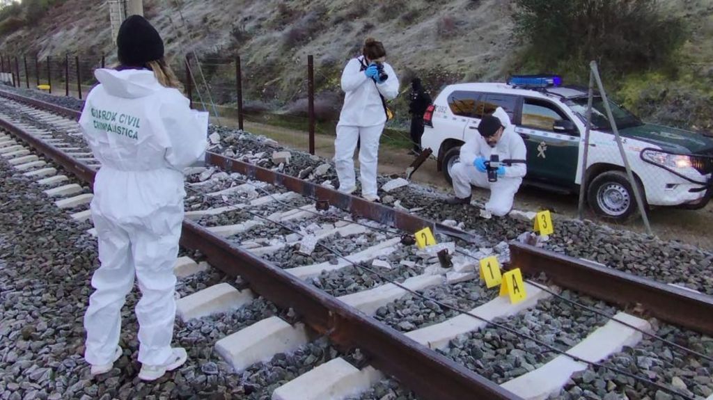
What are the some of the ways that tracks are monitored for fractures like this? It must have been pretty substantial in order to be described as "complete lack of continuity". Makes me think of literally electronic continuity tests -- are those ever used in this context? Or how about cameras mounted on trains using image processing? Or drones?
It seems a shame that a few other trains passed beforehand with this anomaly in place and yet it went undetected.
There are special trains with measurement equipment on board, but yes, it sounds to me like every train should be equipped with some basic sensors for anomaly detection.
100 km/h is slow compared to passenger train (even non-high-speed ones). Depending on how packed the schedule is, it might not be possible to analyse track during the day without causing backups.
AFAIK, one technique for monitoring cracks uses ultrasonic sensors. They send sound waves through the rails and detect cracks by analyzing reflected waves.
You can look at the Wikipedia page on railway defect dectectors [0].
Under "rail break monitors" it mentions both electrical continuity and time-domain reflectometry can be used, and are most frequently used on high-speed tracks.
In addition, there are vast array of other detectors using acoustic sensors, strain gauges, accelerometers, cameras in the visible and infrared spectrum or laser measurement, that potentially could have detected an anomaly (i.e. damage to the wheels of other trains before the incident).
Wheel impacts are the main way. But hardware can be bulky and trains can be surprisingly cramped.
We squeezed some track condition monitoring hardware into some locos but it was single-driver operations locations and we cannibalised some of the room that would have otherwise been occupied by the second driver.
I suppose that counts/was caused by a fracture but almost a half meter of gap in the track is nuts. Like describing a limb that’s totally removed as a bone fracture.
Though conceivably the break was very small and a train impacting the slightly lifted rail just caused a good chunk of it to explode.
> Though conceivably the break was very small and a train impacting the slightly lifted rail just caused a good chunk of it to explode.
The crown (top) of the rail seems to be missing after the gap. The crown-less section then continues ~3 meters before it disappears behind the investigator on the left. IDK what that might indicate.
Yes, the “fracture” (the problem was actually at a joint) was there for a while. The missing segment of rail was still there when the train arrived - the derailment affected only the last cars.
The "fracture" being referred to is a weld that somehow failed. The gap you are seeing is because an enormous, heavy train travelling at 200km/h hit that fracture and the rear half of the train derailed, tearing up sleepers and kicking all manner of debris around including ballast and, in this case, parts of newly-fractured (and therefore weakened) track.
No, that gap was created after the rail broke and the train derailed as a result.
The crack was in the weld, causing one side to sink and the wheel to hit the start of the next section of rail which was no longer welded to it, causing stress fractures to form in the rail which later caused that 40cm piece to break off.
reply